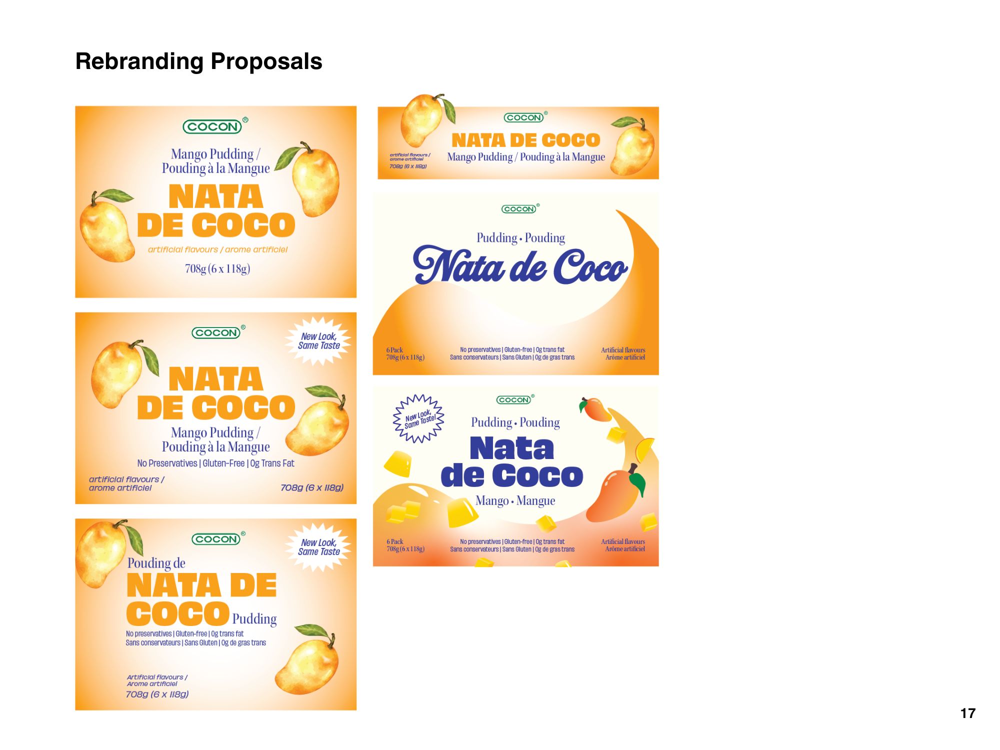
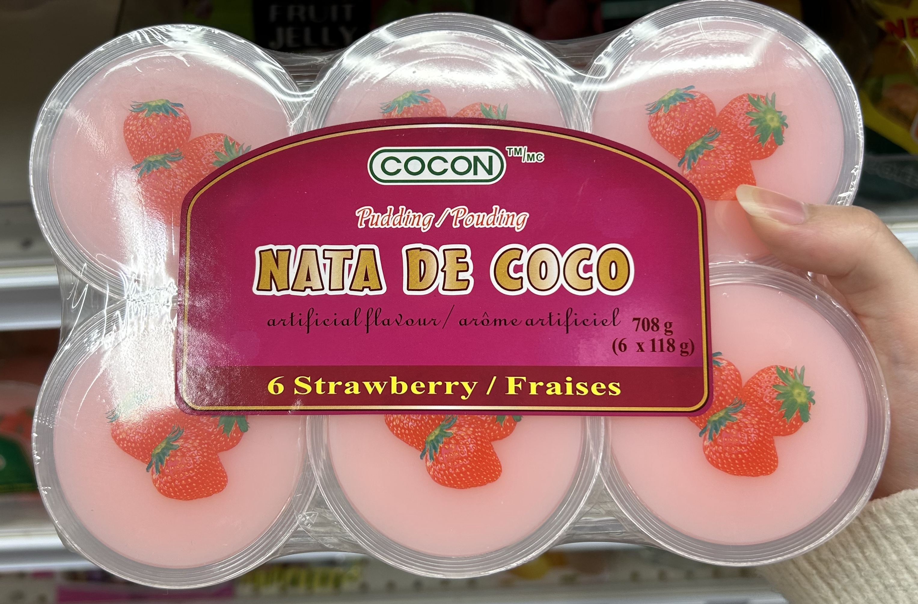
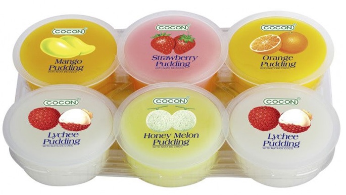
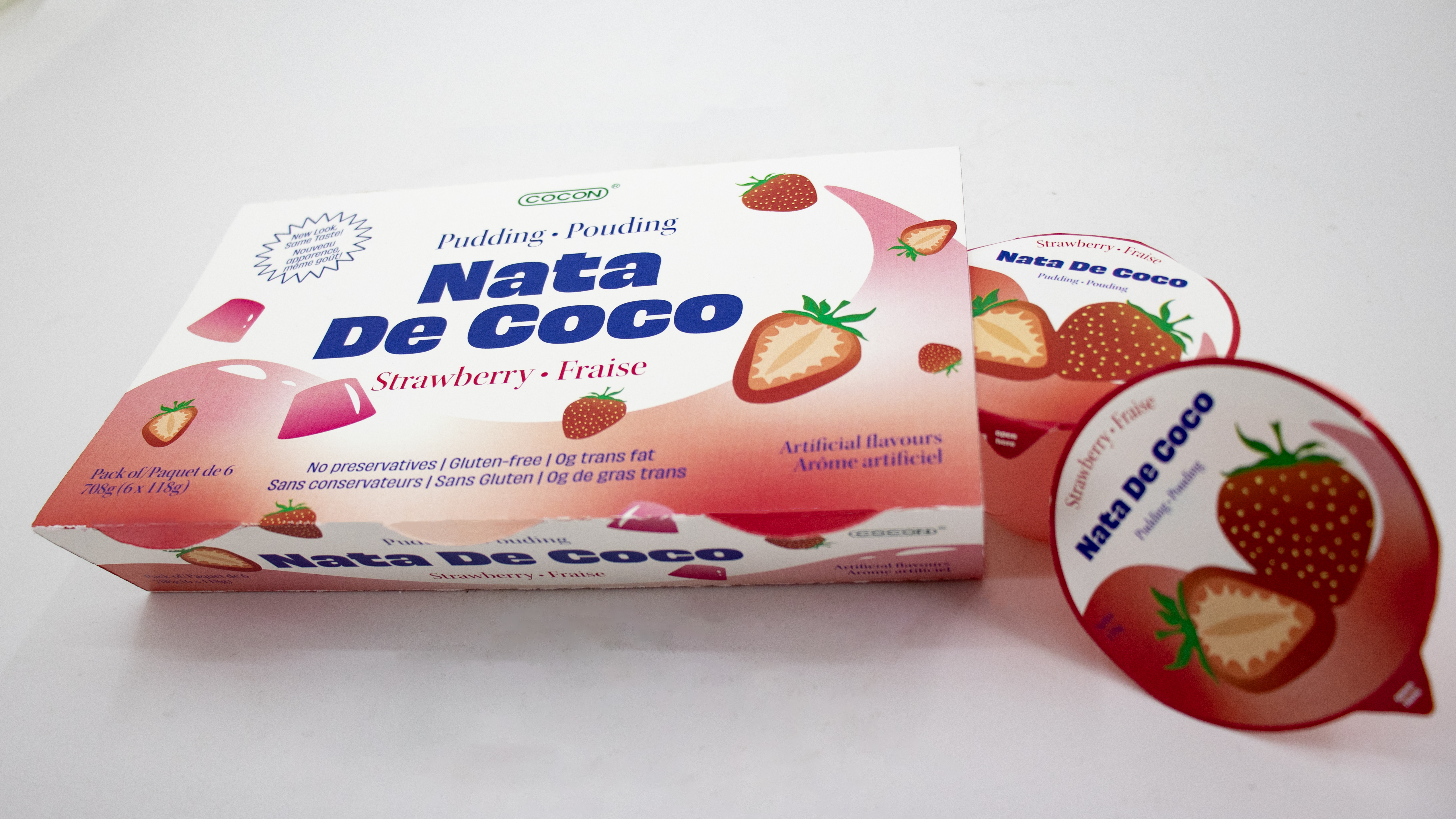
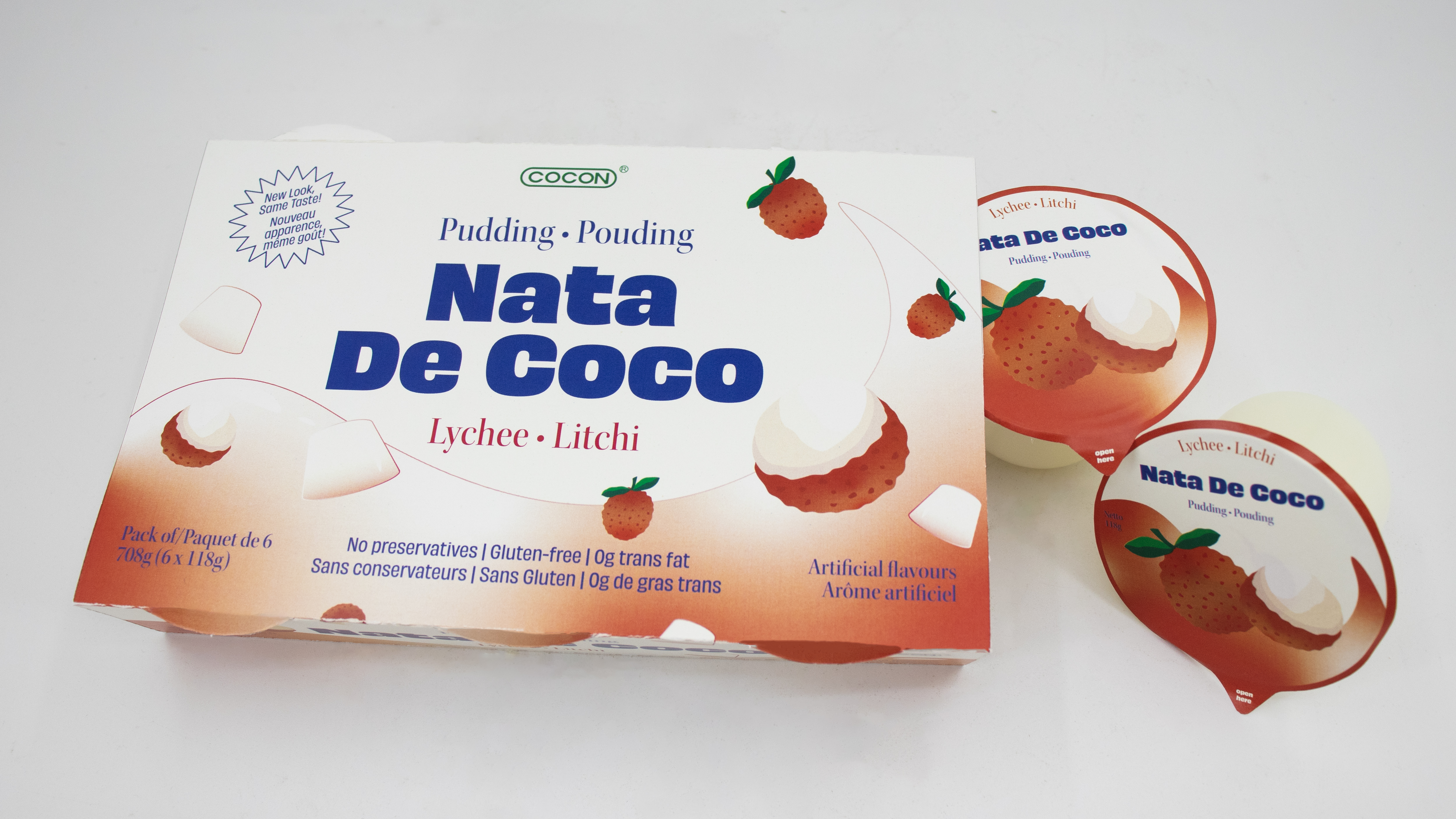
For my packaging design class, my partner Adriana Sal Y Rosas and I redesigned the packaging for 3 flavours of Cocon’s Nata De Coco Pudding, a classic Asian snack manufactured by a Malaysian snack company.
I chose this product after identifying its weaknesses in sustainability, appealing to the target market, and visibility on the shelf.
Redesign Objectives
Increased sustainability:
Using recyclable substrates and promoting reusability wherever possible.
Increased visibility:
Switching from one principle display panel (PDP) to two for versatile shelf placement.
Modernized branding:
Using brighter colours, updating illustrations, improving information hierarchy, and promoting health benefits to target parents of young children.
Sustainability Initiatives
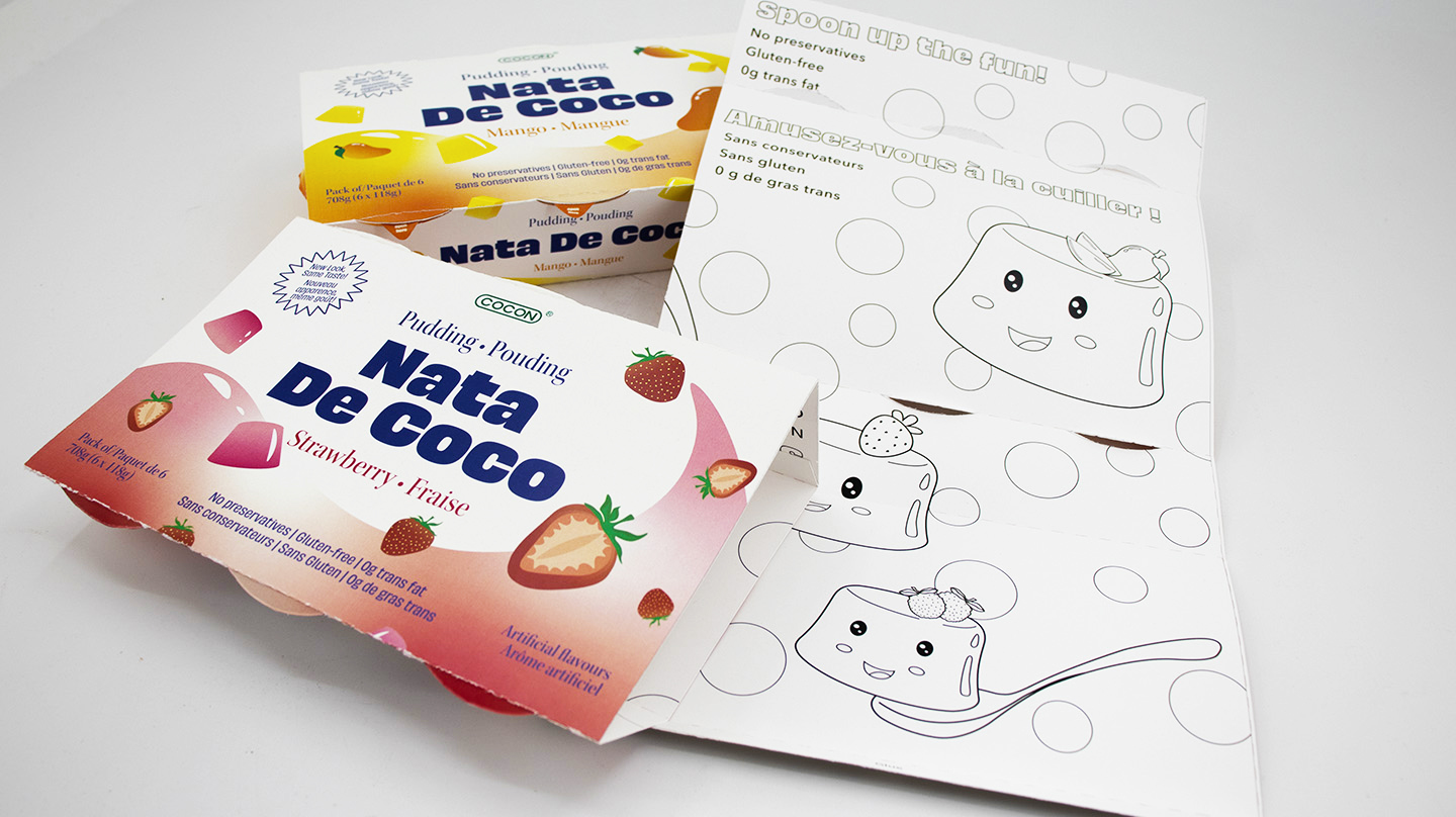
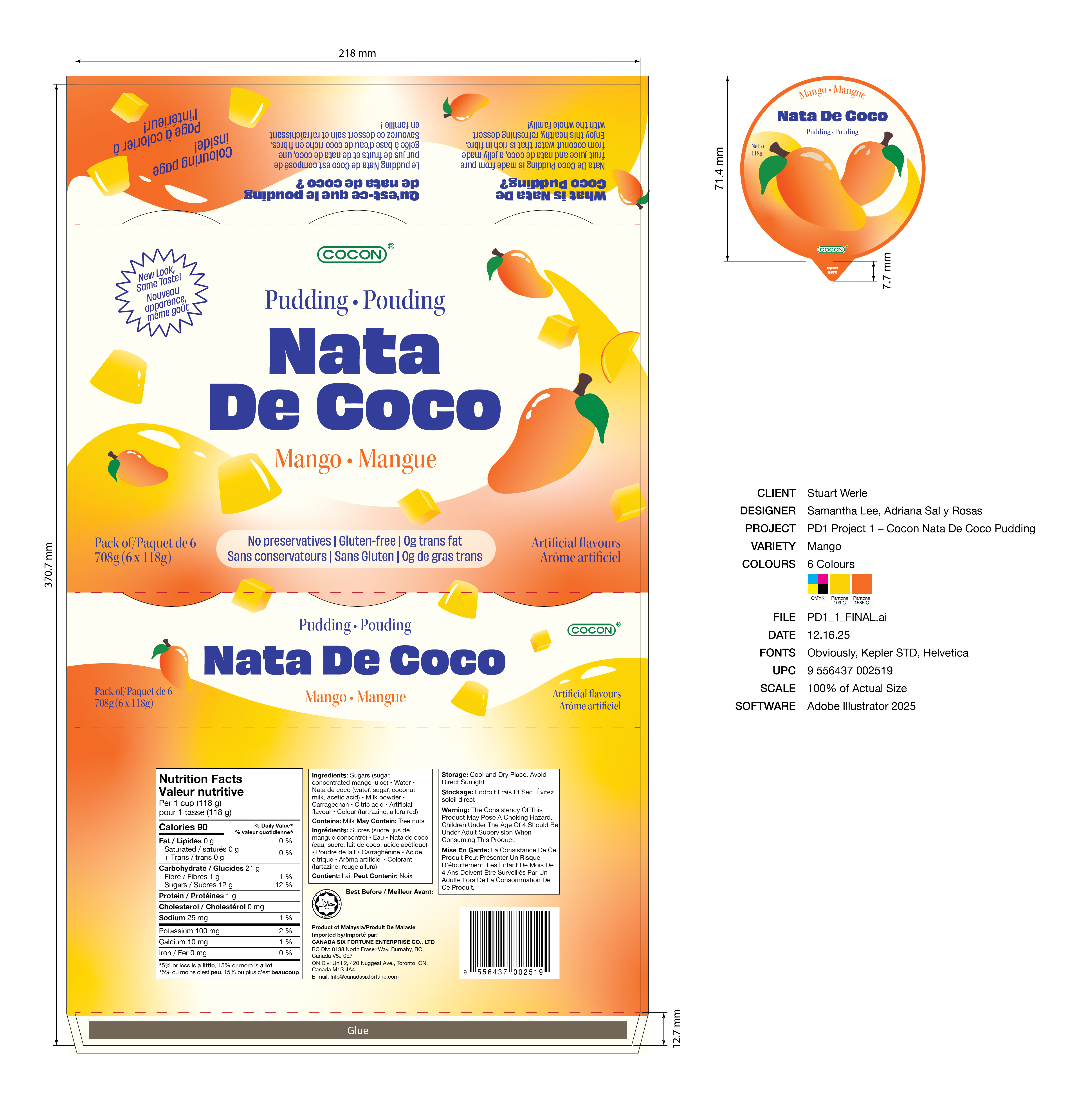
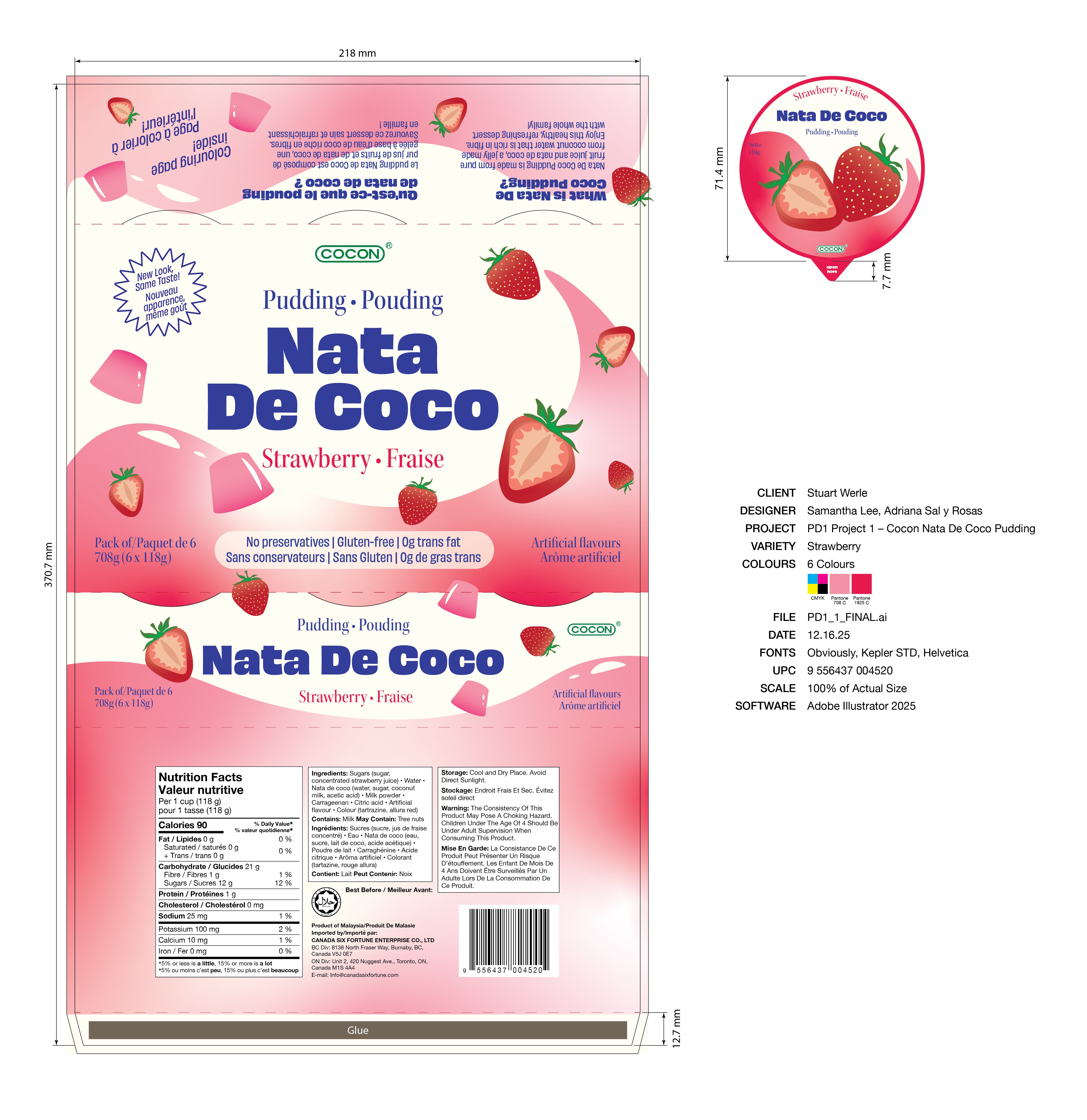
Outer Packaging Form
The plastic wrapping encasing the pudding cups has been replaced with a recyclable paperboard wrap-around that allows for consumers to view the product from the side. This packaging form also allows for two PDPs: one on the top and one at the front.
Reusability
To promote reuse and brand loyalty, the inside of the wrap-around has a colouring page for kids, extending the life-cycle of the packaging.
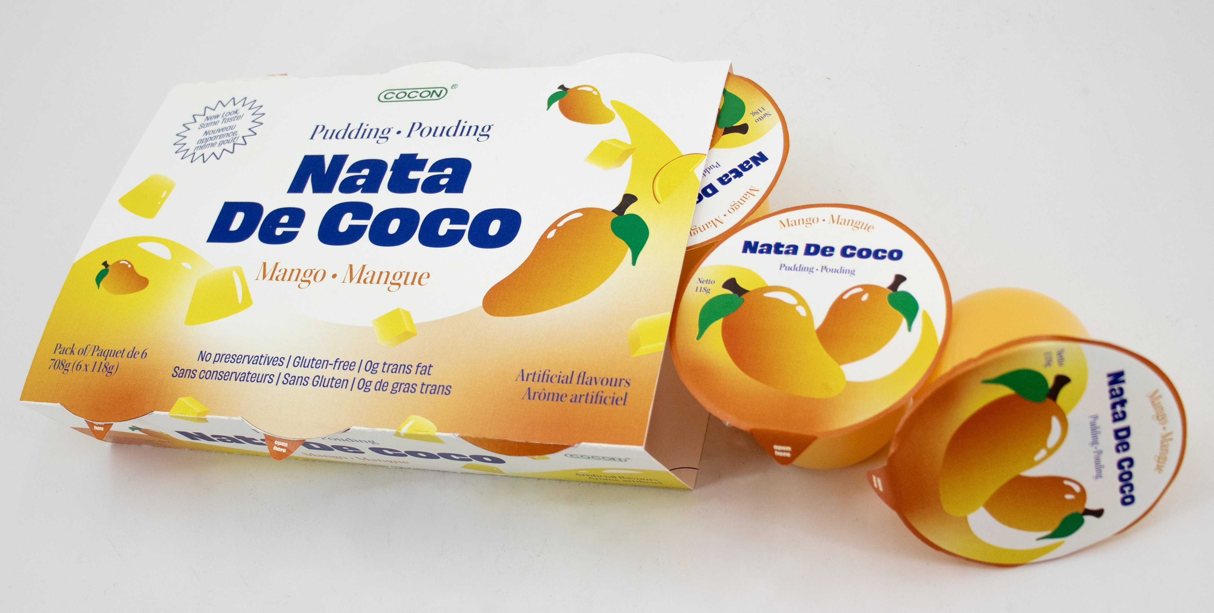
Pudding Cup Substrate
The pudding cups substrate has been replaced with PLA (polylactic acid) cups. It offers faster biodegradation, leaves no toxic residue under industrial composting conditions, and is made from from renewable plant-based materials like corn.
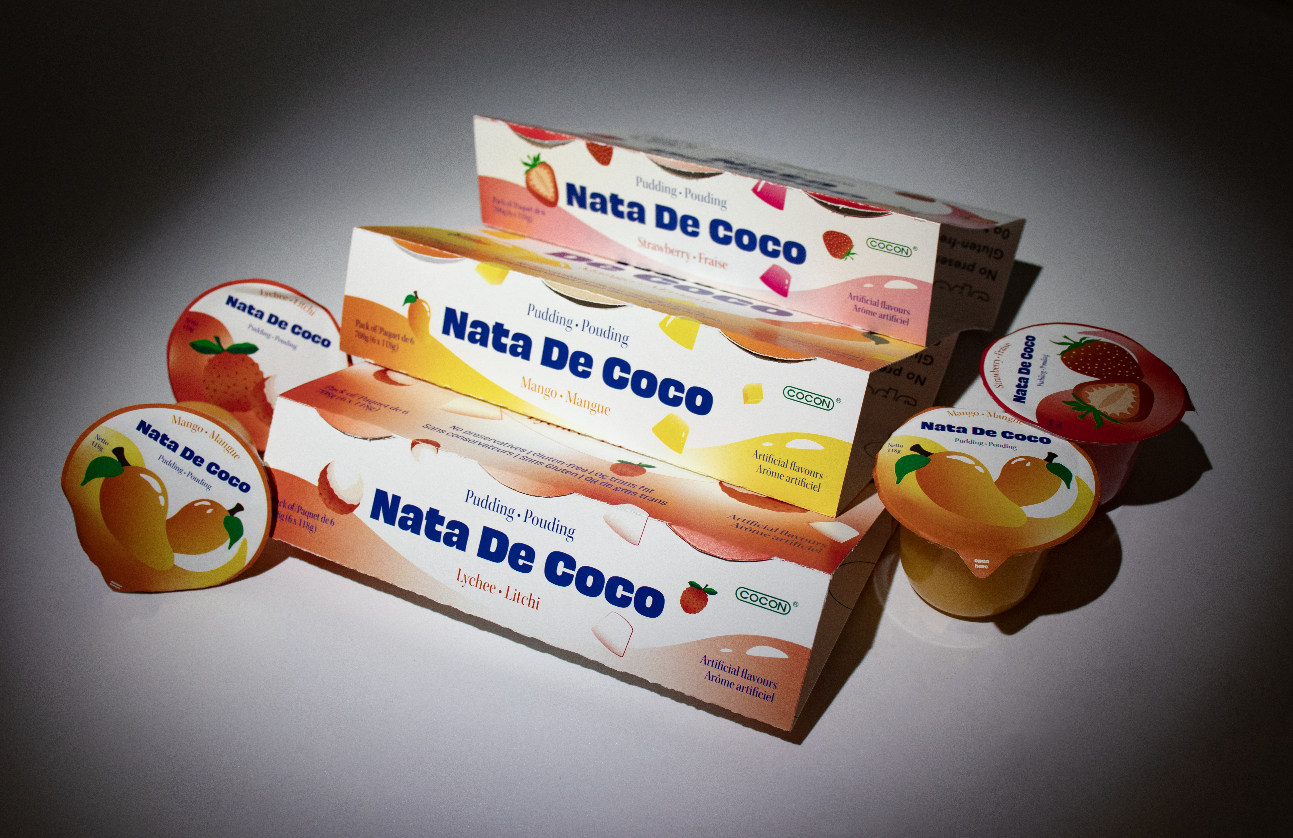
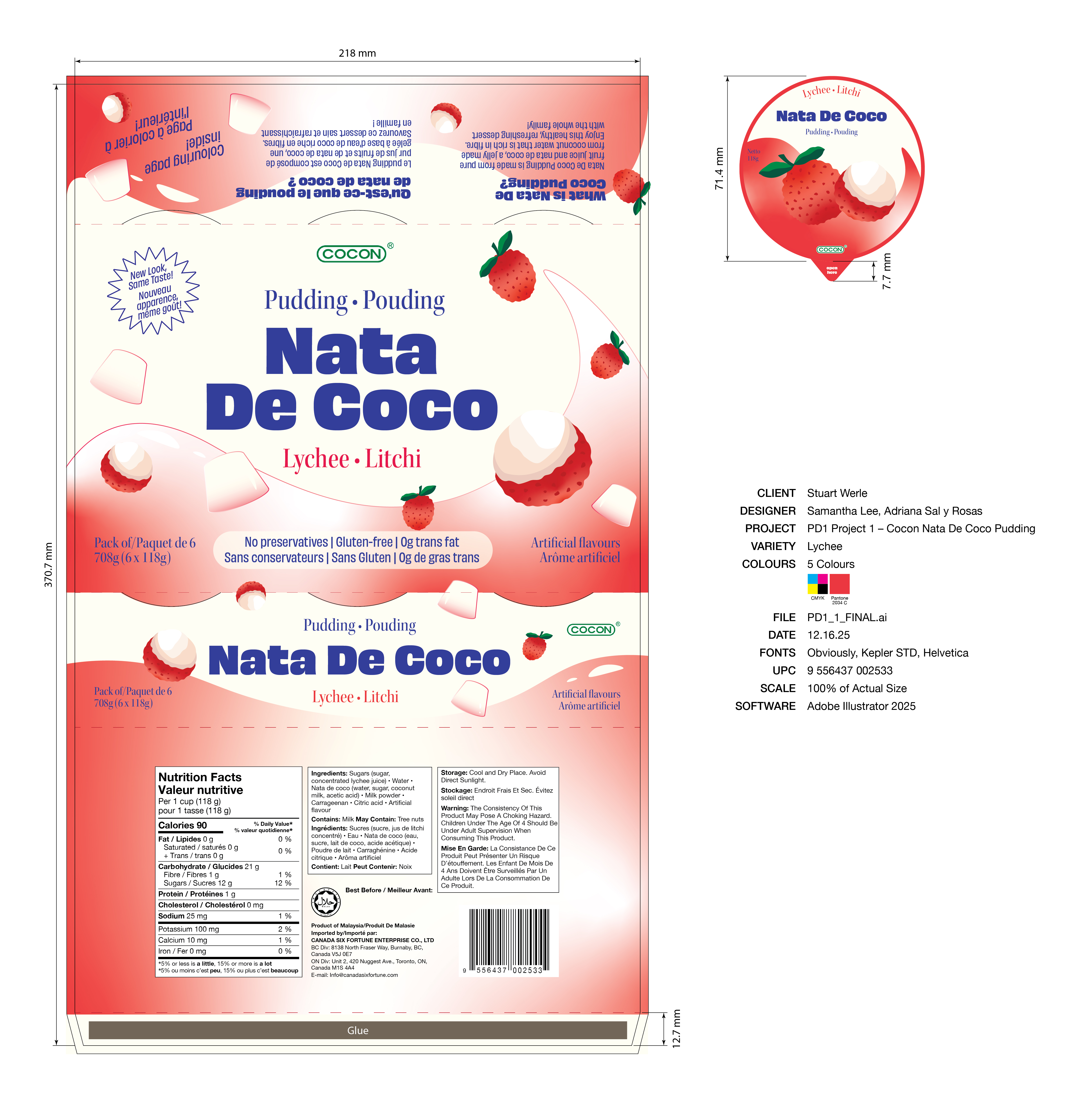
The Final Design Solution
The redesign takes inspiration from the classic local Malaysian packaging through the use of a serif font as well as the globalized packaging’s hierarchy, colours, and gradients. It is fun, appetizing, and friendly and has two PDPs for versatile placement on the shelf.
To make the product more accessible to a mainstream market, information about nata de coco and its health benefits are placed on the back panel.
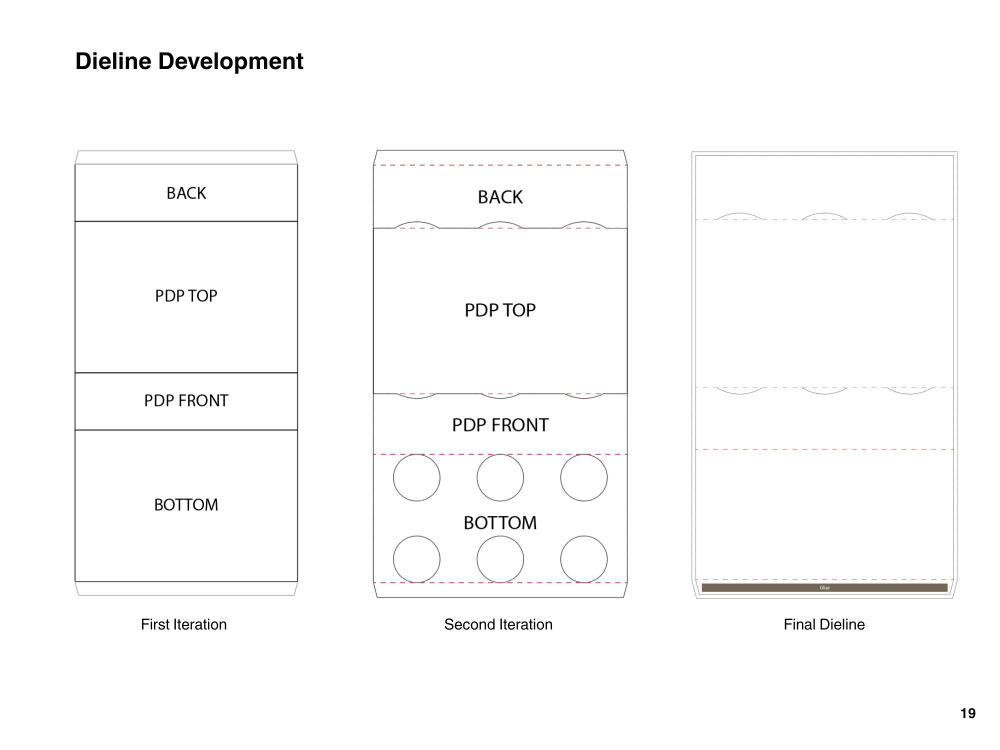
Final Dielines
The dielines were made from scratch, while referencing the packaging forms of competitors in the pudding/jelly category. Cut-outs were also introduced to stabilize the product in the package without incorporating any additional material.
Process
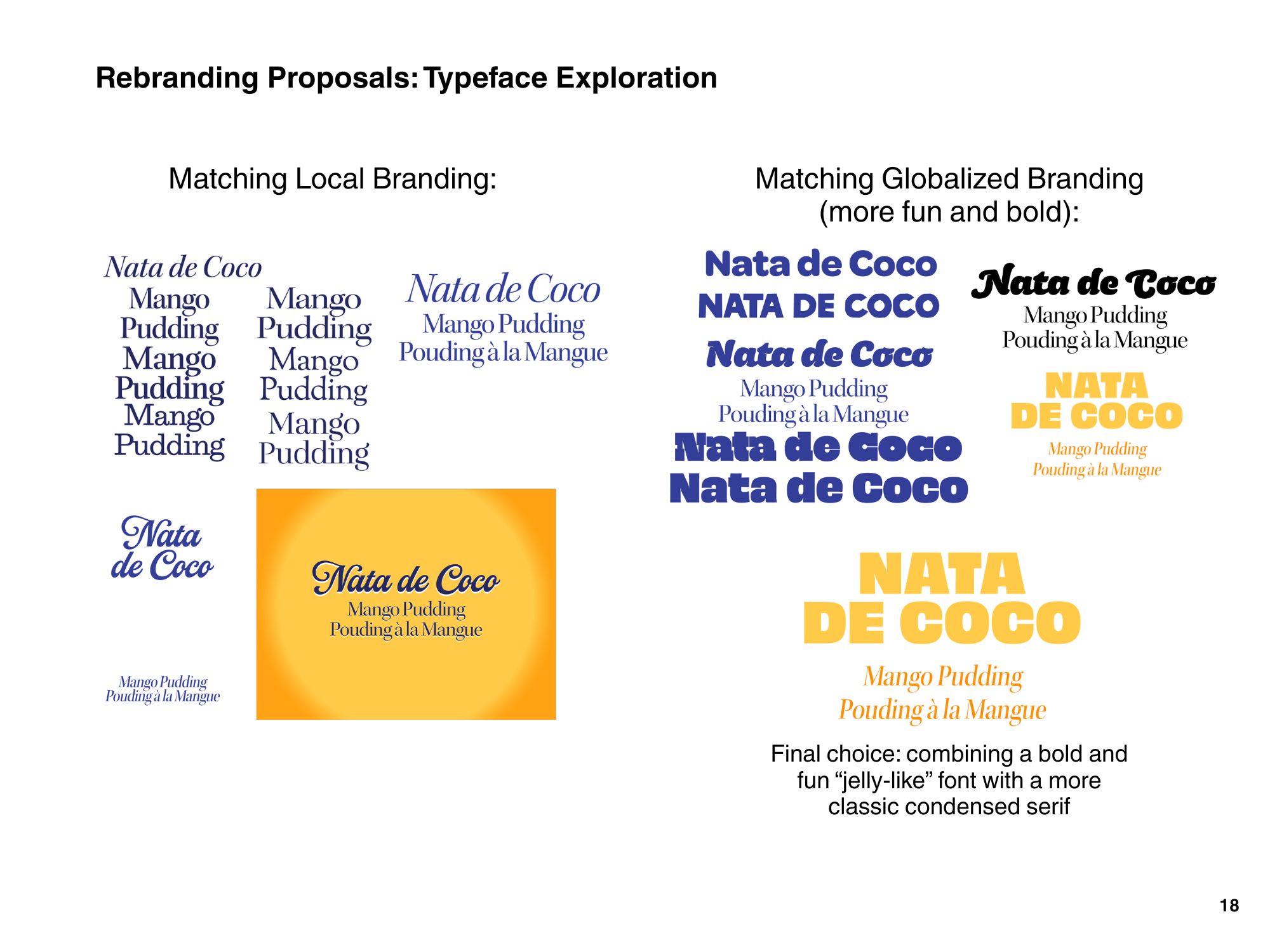
Cocon is a well-known brand among Asian families who grew up with their snacks. However, we wanted to appeal to a more mainstream market with this visual update. We maintained the overall hierarchy and gradient motif while modernizing the typography and using illustrations to communicate flavours.