Hush is an original energy drink brand created for my Packaging Design class that promotes quiet focus through natural sources of caffeine. This was designed in collaboration with Adriana Sal Y Rosas and Ashley Yip.
Why Energy Drinks?
While researching energy drinks, I identified that many popular brands portray intensity and adrenaline, targeting audiences such as active lifestyles and late-night gamers.
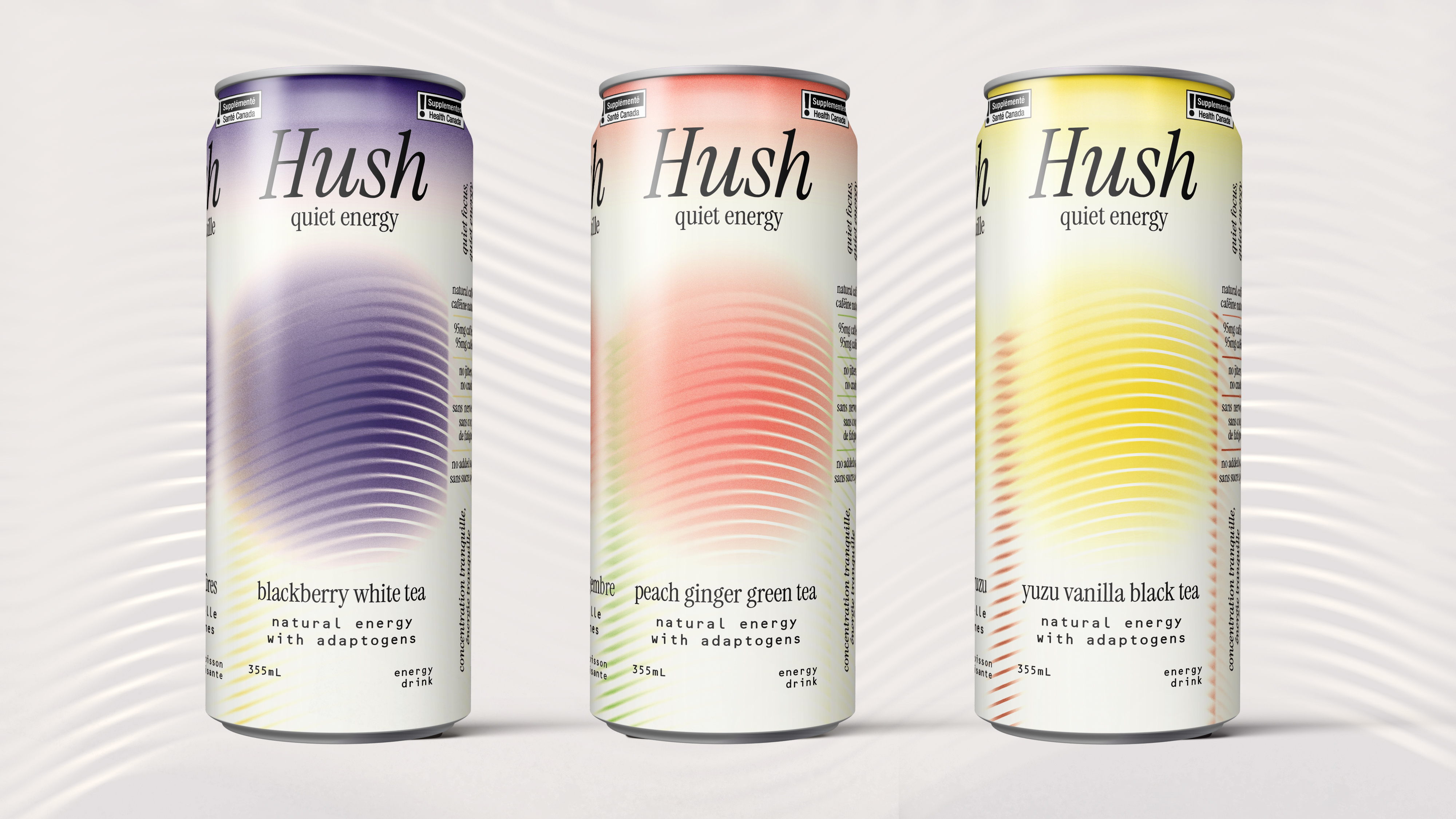
Hush subverts the intensity of the energy drink category through our calm visual identity, responsible messaging, and natural tea-based flavours.
Target Audience
The target group for Hush consists of working professionals who need a healthy energy boost for their long hours.
Hush gives the customer a steady caffeine boost that lasts for a long time that puts the mind in a "flow state" and does not cause any adverse effects such as jitters, anxiety, or caffeine crashes.
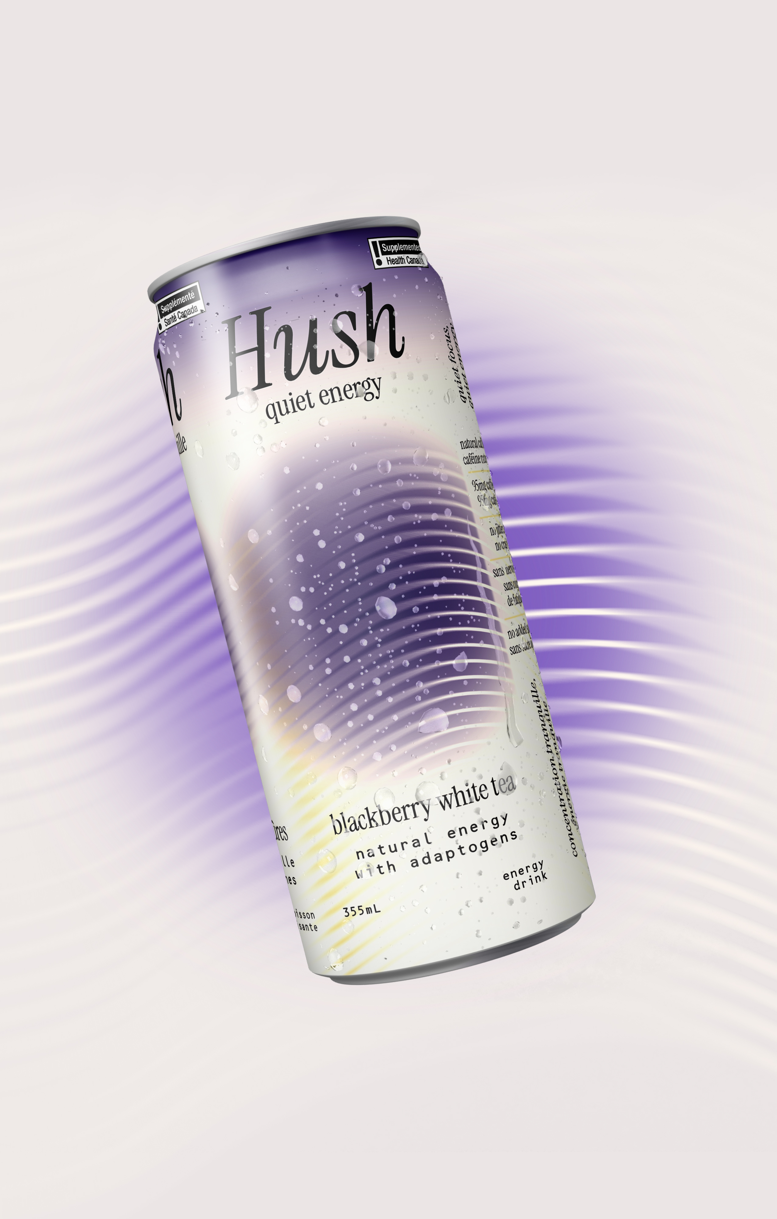
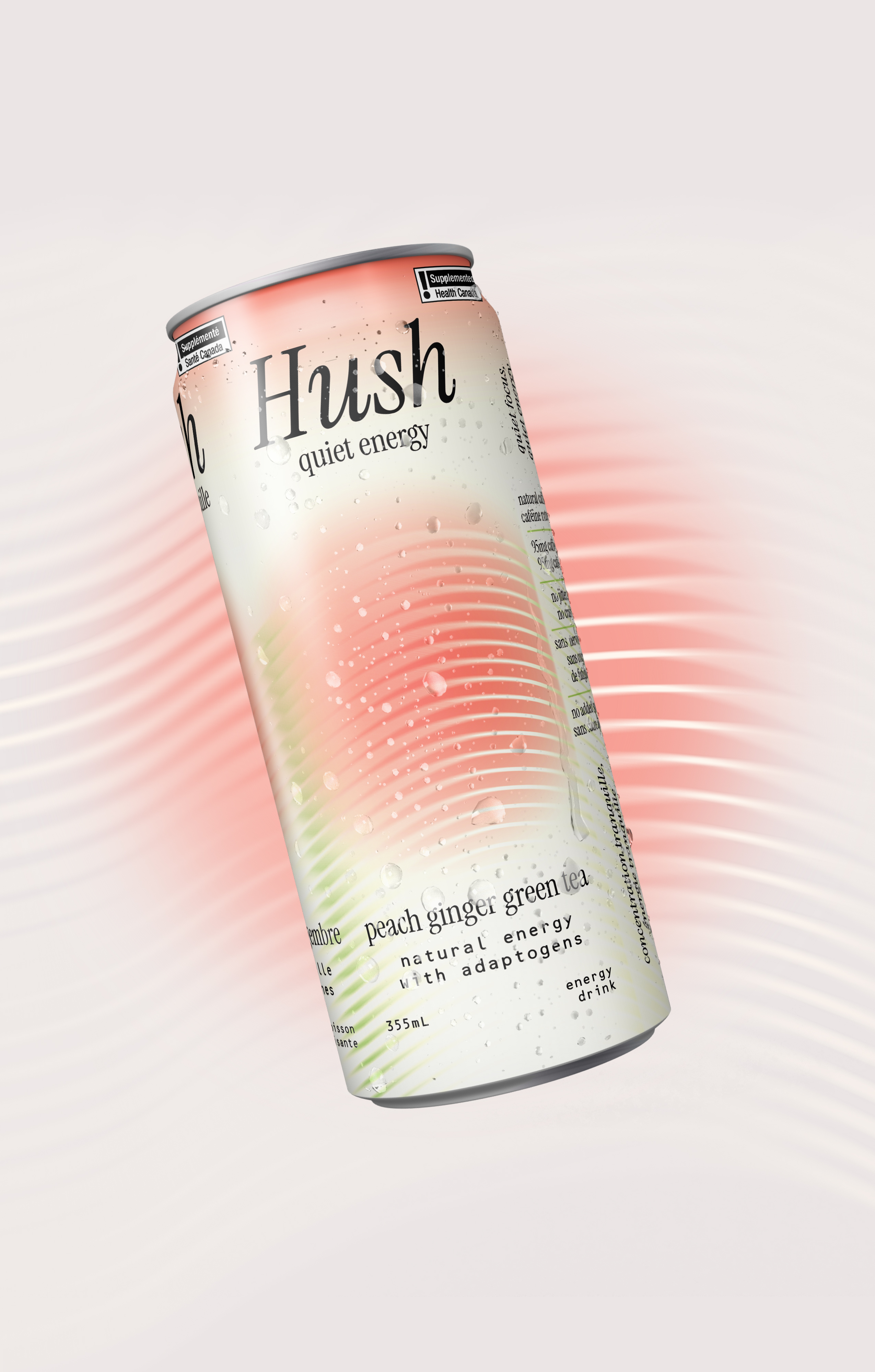
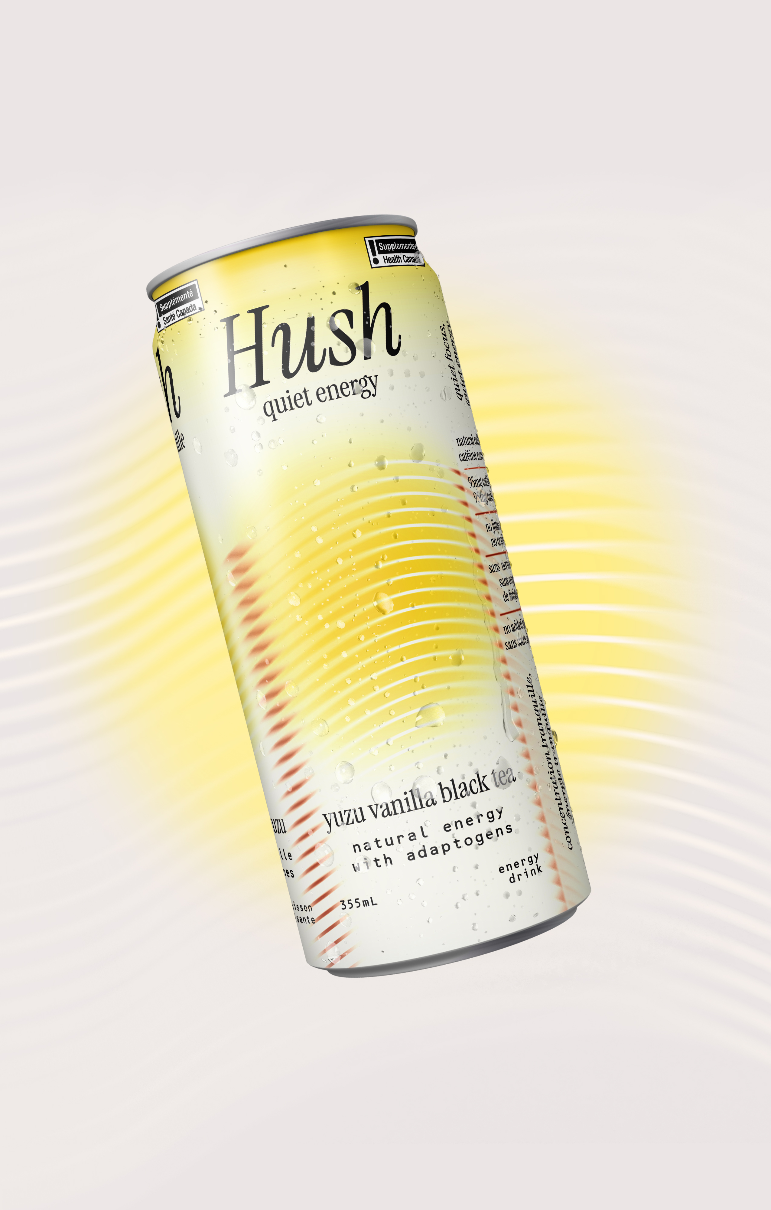
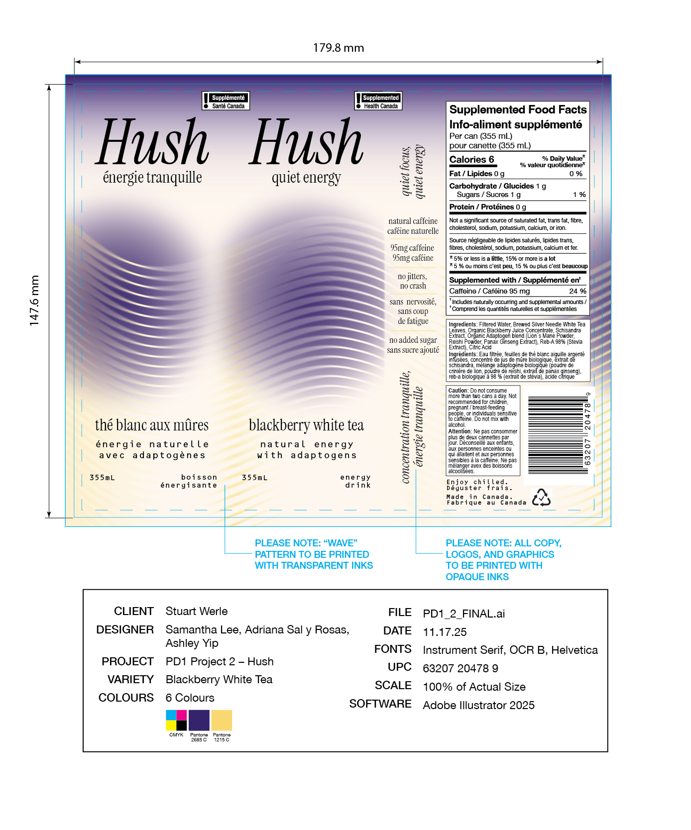
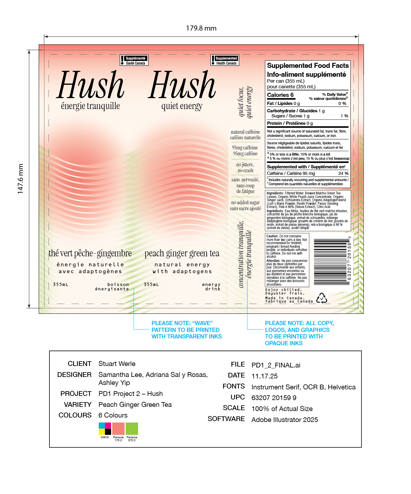
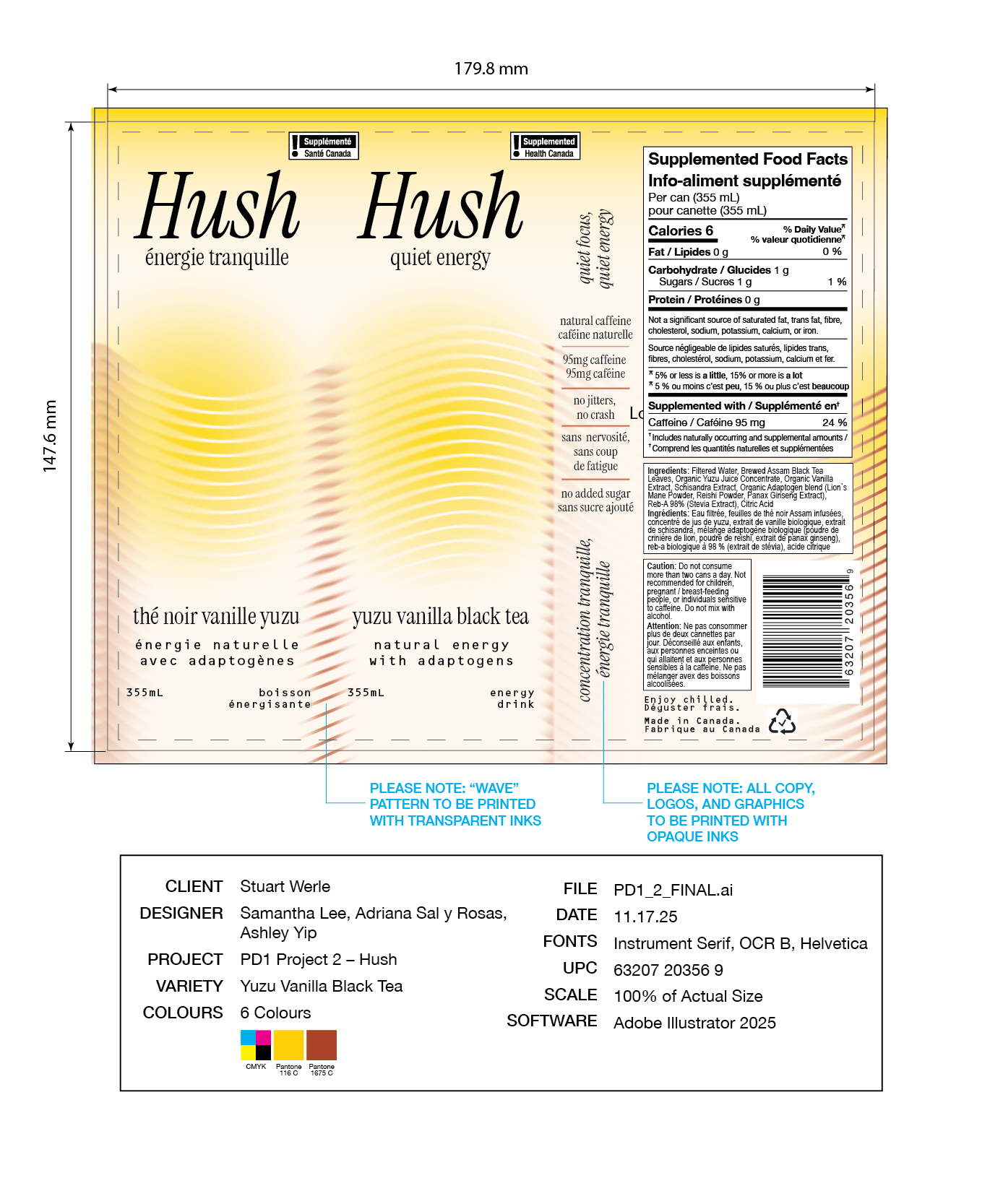
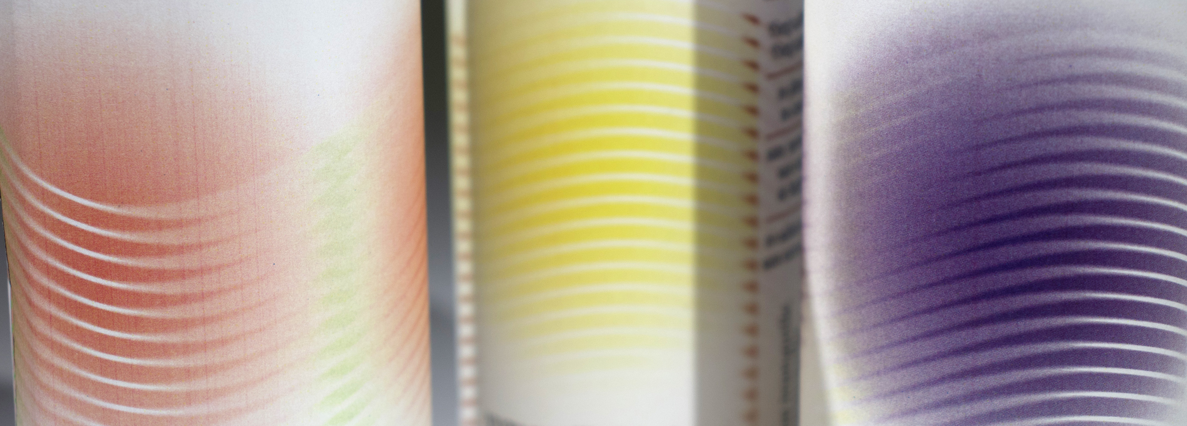
The final packaging design reflects Hush’s brand positioning as a mindful, natural energy drink through soft gradients and blurred lines. The repeating wavy lines represent the "flow state" and steady stream of energy that Hush provides.
Final Dielines